Data is the new oil. In today’s fast-paced, data-driven world, businesses and organizations are awash with information. But raw data, in its numerical form, is often a complex and overwhelming landscape. This is where data visualization comes to the rescue.
Transforming data into visual representations is no longer just an aesthetic choice; it's a strategic imperative. Effective data visualization can turn a labyrinth of numbers into a clear and compelling story. It’s about bridging the gap between raw data and actionable insights.
However, the challenge lies in conveying complex information accurately and engagingly. With countless chart types and design options available, creating a visualization that truly resonates can be daunting. This blog aims to illuminate the path to effective data visualization, guiding you through the process of choosing the right chart, designing compelling visuals, and harnessing the power of interactive charts.

The Art of Chart Design
A well-designed chart is more than just a pretty picture; it's a powerful tool for communication. Several key elements contribute to creating effective visualizations:
Key Principles of Effective Chart Design
- Clarity: The chart should be easy to understand at a glance. Avoid clutter and unnecessary elements.
- Simplicity: Less is often more. Focus on highlighting the most important insights.
- Accuracy: The data should be represented correctly and without distortion.
- Relevance: The chart should align with the story you're trying to tell.
Color Psychology in Data Visualization
Color can significantly impact how a chart is perceived. Consider the following when choosing colors:
- Contrast: Ensure text and data points are easily readable against the background.
- Harmony: Use a consistent color palette for related data points.
- Meaning: Colors can be used to represent categories or emphasize specific data points.
- Accessibility: Be mindful of color blindness when selecting colors.
Chart Layout and Organization
The arrangement of elements within a chart affects how easily information is consumed:
- White space: Use white space effectively to create visual balance and improve readability.
- Alignment: Align chart elements consistently to create a sense of order.
- Gridlines: Use gridlines judiciously to aid in data interpretation.
- Chart size: Ensure the chart is large enough to display details clearly.
Using Annotations and Labels Effectively
Annotations and labels provide context and clarity:
- Titles: Clearly state the chart's purpose.
- Axis labels: Clearly indicate the data represented on each axis.
- Data labels: Add data values directly to data points when necessary.
- Callouts: Highlight specific data points or trends.
Maintaining Visual Hierarchy
Visual hierarchy guides the viewer's eye through the chart:
- Emphasis: Use size, color, and placement to emphasize important data points.
- Contrast: Create visual contrast to differentiate between data elements.
- Consistency: Apply visual hierarchy consistently throughout the chart.
By following these principles, you can create charts that are not only visually appealing but also effective in communicating your data story.

Configurable Charts: A Game-Changer
The static nature of traditional charts often limits their ability to fully convey complex data stories. Enter configurable charts: dynamic visualizations that empower users to explore data interactively.
The Benefits of Customizable Charts
- Enhanced Data Exploration: Configurable charts allow users to delve deeper into data by filtering, sorting, and zooming.
- Improved Decision Making: By enabling users to manipulate data, configurable charts foster a deeper understanding of trends and patterns.
- Increased Engagement: Interactive elements make data visualization more engaging and enjoyable.
- Customization: Users can tailor charts to their specific needs and preferences.
Interactive Charts and Their Impact on Engagement
Interactive charts go beyond static visuals by allowing users to:
- Filter data: Focus on specific segments or categories.
- Drill down: Explore data at different levels of detail.
- Compare data: Analyze multiple data points simultaneously.
- Highlight trends: Identify patterns and outliers.
When users can interact with data, they are more likely to spend time exploring and understanding it. This leads to a deeper connection with the information and better decision-making.
Real-World Examples of Configurable Charts in Action
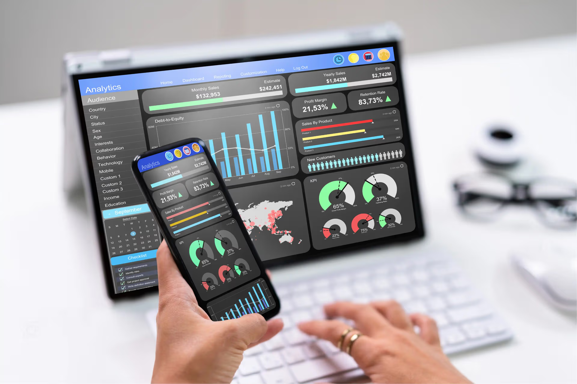
- Interactive dashboards: Used in business intelligence to monitor key performance indicators (KPIs) and explore underlying data.
- Data exploration tools: Enable analysts to uncover hidden patterns and insights.
- Online news visualizations: Offer interactive experiences for readers to explore complex data stories.
How to Choose the Right Level of Interactivity
Too many interactive elements can overwhelm users. It's essential to strike a balance:
- Know your audience: Consider their technical expertise and data familiarity.
- Focus on key insights: Highlight the most important interactive features.
- Test and iterate: Gather feedback to refine the interactive experience.
Best Practices for Creating Interactive Charts
- Clear and intuitive controls: Make it easy for users to interact with the chart.
- Responsive design: Ensure charts work well on different devices.
- Performance optimization: Avoid slow loading times, especially for large datasets.
- Accessibility: Consider users with disabilities when designing interactive elements.
By following these guidelines, you can create configurable charts that are both engaging and informative.
Data Visualization Best Practices
Creating visually appealing and informative charts is essential for effective communication. Here are some key best practices:
- Keep it simple: Avoid cluttering the chart with unnecessary elements. Focus on the key message.
- Choose the right chart type: Match the chart type to the data and the story you want to tell.
- Use color strategically: Enhance visual appeal and highlight important information, but avoid overuse.
- Label clearly: Ensure axes, data points, and legends are easily understandable.
- Tell a story: Use charts to narrate a compelling data story.
- Consider your audience: Tailor the chart's complexity and level of detail to the audience.
- Test and iterate: Get feedback on your charts and make improvements based on user insights.
Incorporating Storytelling into Data Visualization
Data visualization is not just about presenting numbers; it's about telling a story. Consider the following:
- Identify the key message: What do you want the audience to take away?
- Choose a narrative structure: Create a flow to guide the viewer through the data.
- Use visuals to support the story: Images, icons, and other visual elements can enhance the narrative.
- Consider the audience's perspective: Tailor the story to their interests and knowledge level.
By following these best practices and incorporating storytelling techniques, you can create data visualizations that are both informative and engaging.
BioBrain: Elevating Data Visualization
BioBrain takes data visualization to the next level by offering automated, customizable, and insightful solutions. With Biobrain, you can:
- Visualize with Ease: Effortlessly transform your data into compelling charts and graphs with just a few clicks. BioBrain's intuitive interface allows you to quickly explore your data visually.
- Customize to Perfection: Tailor your visualizations to match your specific needs and preferences. With BioBrain's high degree of configurability, you have complete control over the look and feel of your charts.
- Uncover Deeper Insights: Beyond basic visualizations, BioBrain offers advanced analytics and statistical modeling to uncover hidden patterns and trends.
- Compare and Contrast: Conduct in-depth analysis by comparing different datasets or segments using interactive visualizations.
- Automate for Efficiency: Save time and effort with automated data preparation and visualization processes. BioBrain's AI-powered capabilities handle routine tasks, allowing you to focus on higher-level analysis.
By combining automation, customization, and advanced analytics, BioBrain empowers users to extract maximum value from their data and make informed decisions.
Remember, the goal of data visualization is not just to display data but to reveal its meaning. By investing time and effort in creating high-quality charts, you can improve decision-making, enhance communication, and unlock the full potential of your data.
Start experimenting with different chart types, design elements, and interactive features to find what works best for you and your audience.


